AI based health feed that helped 3x the retention of app with 1 Million users #Mobile #B2C
Jul 17, 2025
Health data is overwhelming. People check once, then ghost the app.
Our goal: turn that into a daily, helpful habit.
Lead & Sole Designer – Period App
Team: Me (design + medical insight) + 1 developer
Roles I played:
UX Designer – Led the product from research through delivery
Doctor – Ensured medical accuracy in emotional forecasts, cycle education, and tips
Visual Designer – Created UI, data visualizations, and motion effects (including haptics) to make the app feel warm and human
Strategist – Turned thousands of feedback points into habit loops, product decisions, and monetization ideas
The Problem
Women’s health is still poorly researched. Even what’s known often doesn’t reach the women who need it.
Most period apps focus on logging cycles, but they rarely help women understand how their bodies, minds, and energy change day to day.
We wanted to change that. Our goal:
Help women prepare emotionally, physically, and mentally for their day
Make it easy to notice patterns in mood, energy, and symptoms
Turn tracking into a daily ritual, not a chore
The Solution
We built a scrollable, personalized feed that blends science, daily context, and emotional support. It wasn’t just about tracking, it was about making the information feel relevant and personal.
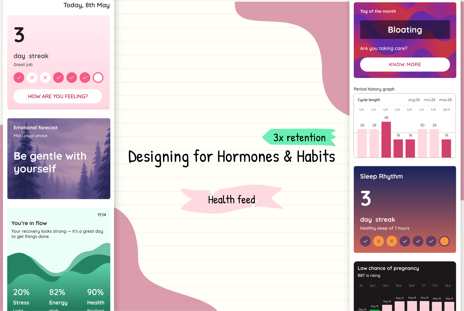
Suggesting Today’s most likely Symptom
We saw users struggling to scroll through a long symptom list every day
So the feed showed the most likely symptom for their current phase: “Cramps”, “Backache”, “Mood swings”
No typing, no extra taps → log in seconds
Impact
Higher completion rates (almost no effort required)
Users felt remembered — like the app “knew” them

Streaks + joyful feedback
Problem: No regular engagement, users didn’t have a reason to log in daily
Solution:
Added daily streaks with small, joyful celebrations
Sent personal notes after logging, tailored to symptoms:
“Add omega-3 rich food for PMS”Gave weekly streak discounts that felt earned, not like generic offers
Impact
Turned logging into a dopamine loop users wanted to maintain
Discounts performed better and reduced “offer blindness”
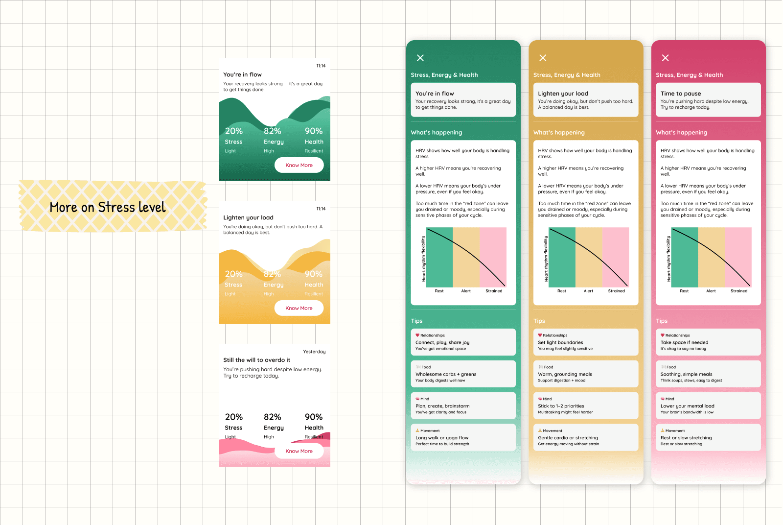
Showing stress as a visual you can feel
Problem: How do we help women understand their energy levels?
HRV (heart rate variability) gave a stress score, but raw numbers felt boring and meaningless
Solution:
Designed a visual: stress shown as liquid rising or falling in a soft-colored container
Used different colors to signal intensity
Paired with a daily tip matched to their energy level
Impact
Made stress data tangible and easy to interpret
Turned an abstract metric into something users could act on immediately

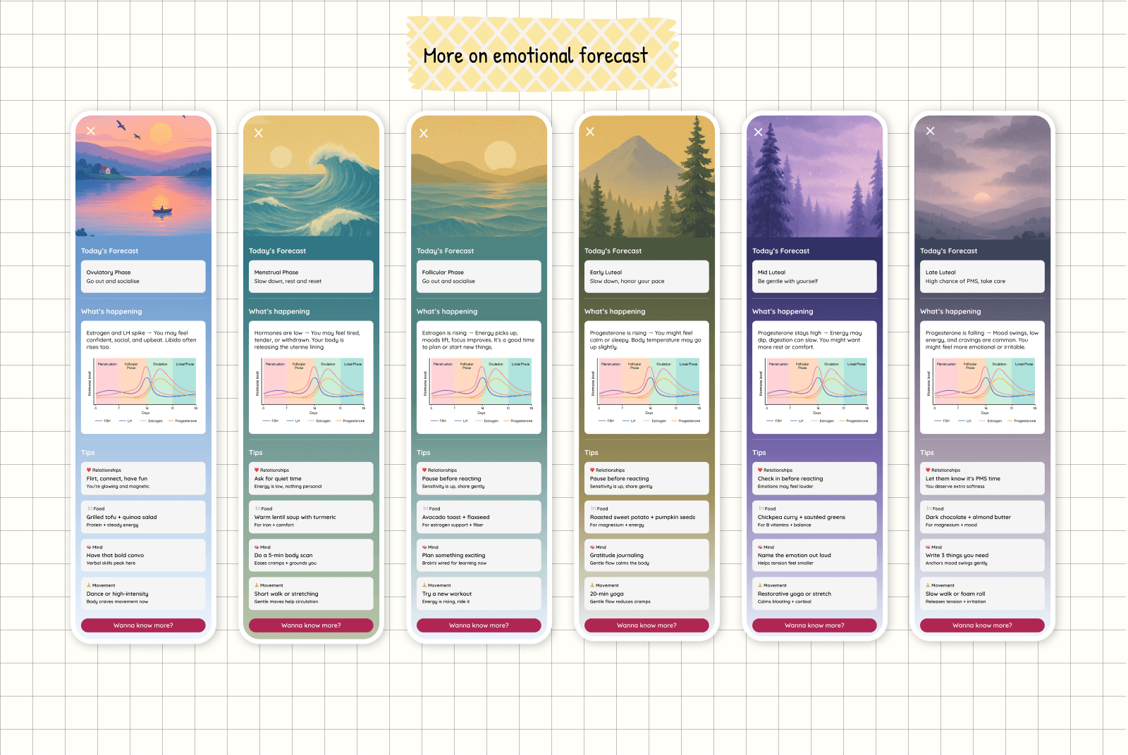
Emotional Forecasts to stay prepared
Problem: Women struggled to understand how hormones influence emotions in repeating patterns — like “seasons”
Solution:
Designed a visual mood forecast, like a weather app for feelings
Paired it with gentle illustrations and personal tips (“Low energy today? Try a slower start”)
Impact
Became one of the most shared features
Validated how users felt and gave them clear language to describe it

Symptoms, community, and curiosity
We wanted users to recognize patterns in their own body:
So we showed the top symptom of the month
Clicking it showed how often they logged it, and when
We added “You’re not alone” context. e.g., “3,201 women logged this today”
That one stat made people stop, read, and reflect.

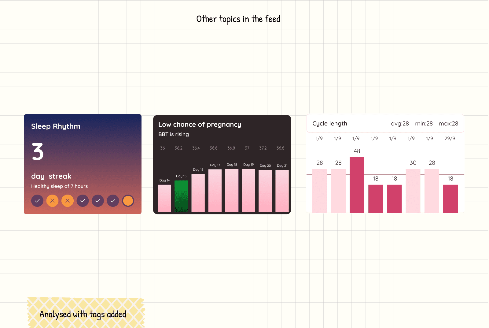
Sleep rhythm from Apple Health
We pulled sleep data directly from Apple Health and translated it into a friendly summary:
“You’ve been sleeping on time 4 days this week.”
This wasn’t just data for the sake of data, it became a signal of recovery, and helped users make sense of their mood or energy dips.
It reinforced a subtle behavior loop: better sleep = better day.
Period analysis that’s not boring
We designed period patterns to feel visual, not clinical.
Instead of a dry calendar, we used color gradients and cycles to show rhythm.
We added insights like, “Your average cycle length is 28 days,” paired with visuals that updated as they tracked.
BBT guidance for fertility tracking
For users trying to conceive, we used BBT (Basal Body Temperature) to offer timely, clear nudges:
“Your temperature is up — this might be a good time to try.”
We made this opt-in and privacy-first, and it became one of the most trusted features.
Simple cues, no jargon.
What worked
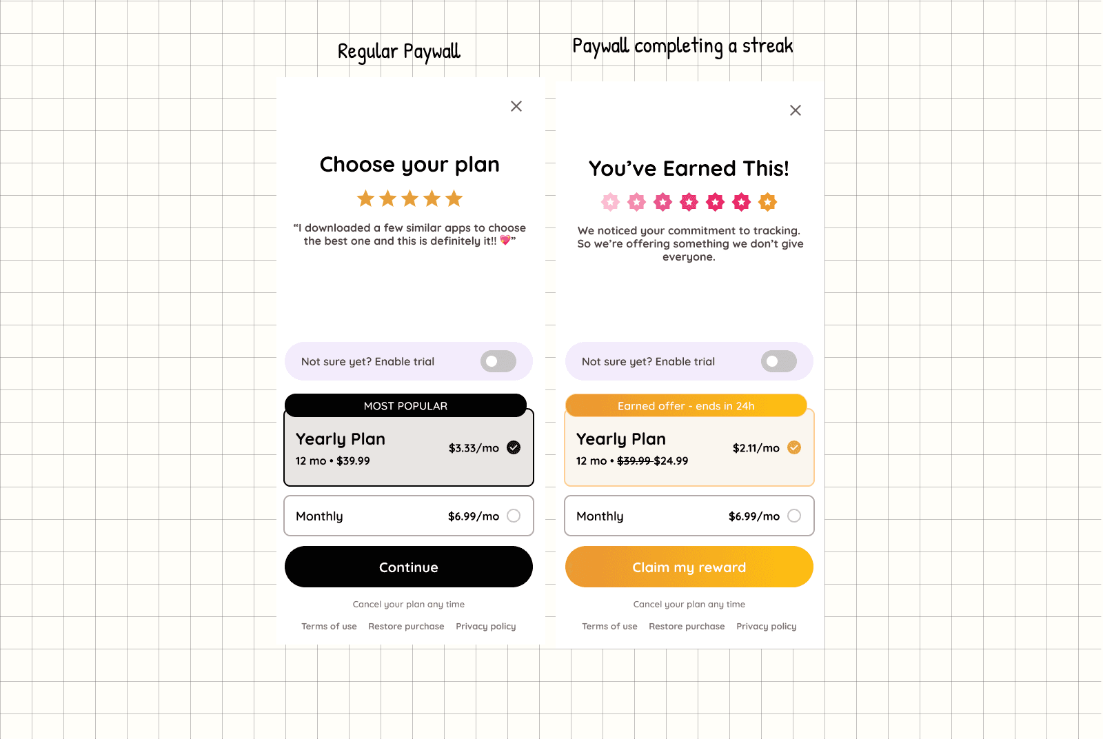
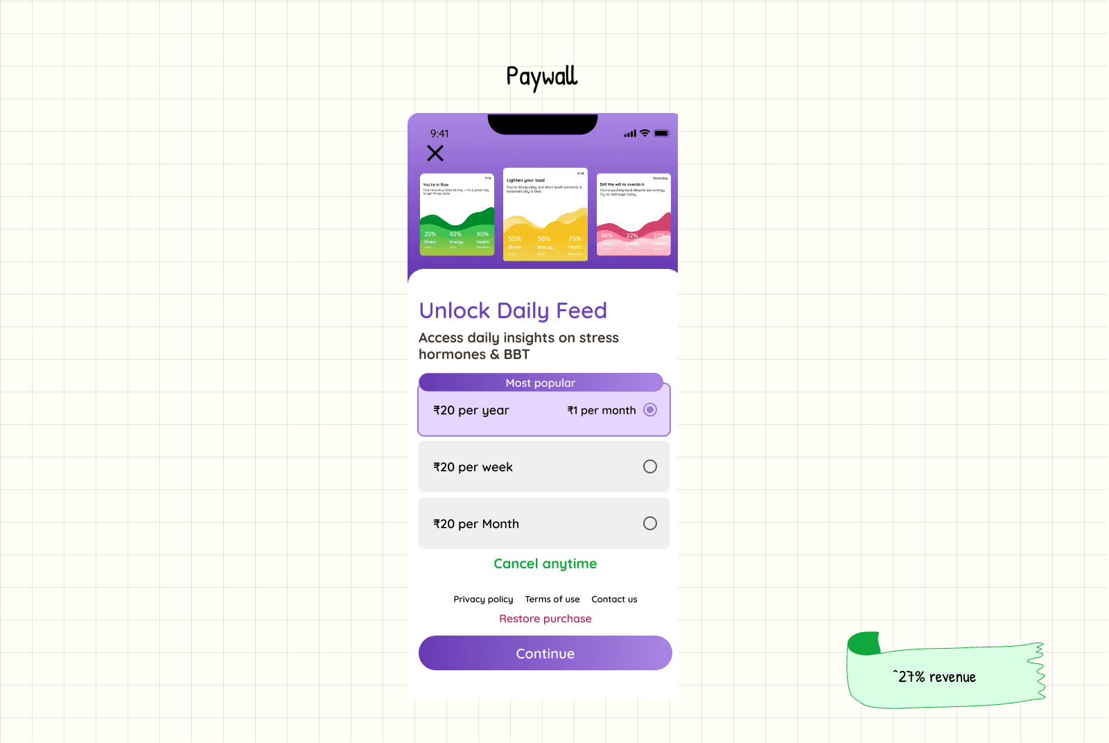
When we gave away the Daily Feed on day one, and then hid it behind a paywall, conversions jumped 25%.
Why?
Because once they experienced the value, they wanted it back.
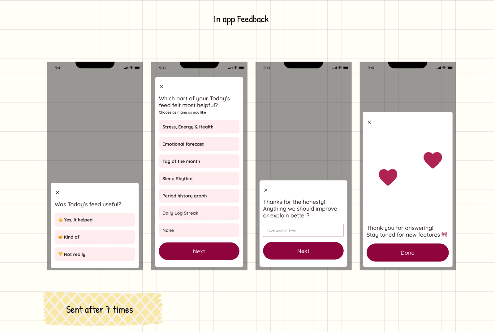
After users had seen the Daily Feed 7 times, we gently asked:
“Was Today’s feed useful?”
70% said yes.
We followed up with:
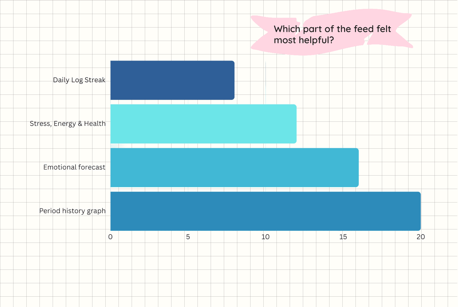
“Which part helped most?”
The top picks were:
Period history graph
Emotional forecast
Stress, energy & health tips
And then we asked, “What could be better?”

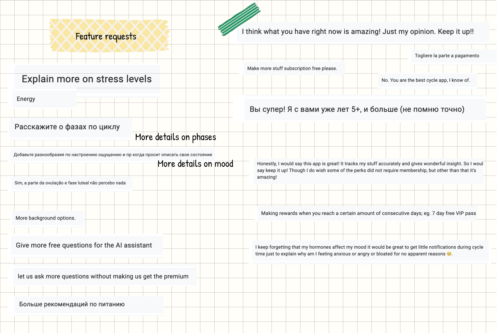
“I want to know more” So we made it happen
Thousands of users gave us feedback on the daily feed. A recurring theme?
They wanted to go deeper.
“This is useful, but I wish I could understand my stress levels better.”
“I want to know why I feel this way.”
“Can you give more tips on sleep and food?”
We heard them.
So we redesigned the cards to be clickable, each one now opens up with more insights, guidance, and tips tailored to their current phase.
From emotional patterns to stress, sleep, and food, users can now explore what matters most to them, right when they need it.
This wasn’t a guess. It came straight from the source. And for tips we used AI to understand their cycle data and give more meaningful tips.
Using AI to Answer What Users Actually Ask
After thousands of pieces of feedback and community questions, one thing was clear:
Users wanted daily, phase-based guidance tailored to them.
So we introduced an AI-powered chat, a space where users could ask anything, and the system would respond based on their individual data.
But we knew people don’t always know what to ask.
So we made it easier to start.
We added a daily card in the feed with a hormonal health tip, changing every day.
When clicked, it opened up one actionable tip each across four areas:
🥗 Food
🧠 Mental health
❤️ Relationships
🏃 Exercise
Why these?
They were the most asked topics in our feedback and community forums—especially around PMS, emotional health, and lifestyle habits.
We even went further: offering follow-up questions like:
“Can I get a simple recipe for this phase?”
“How can I manage PMS in my relationship?”
“What's a gentle 5-min workout for today?”
Users didn’t just engage, they came back more often.
AI chat usage jumped 200% in the first few weeks.
It started as a feature no one asked for just a hopeful idea to make health education more engaging. Honestly, we worried: What if people hate it? But we believed this was the simplest, most accessible way to deliver real value. And over time, it turned into something people loved and asked for more of. That shift was huge.
For me, this project was personal.
As a doctor, it felt deeply fulfilling to educate women about their bodies in a way that’s accessible and empowering.
As a designer, it was a playground balancing behavior loops, feedback, visuals, and storytelling.
And as a data nerd? I had a blast bringing charts, animations, haptics, and user insights to life.
It’s rare to work on something that’s this meaningful and this fun. This one’s staying close to my heart.
Lead & Sole Designer – Period App
Team: Me (design + medical insight) + 1 developer
Roles I played:
UX Designer – Led the product from research through delivery
Doctor – Ensured medical accuracy in emotional forecasts, cycle education, and tips
Visual Designer – Created UI, data visualizations, and motion effects (including haptics) to make the app feel warm and human
Strategist – Turned thousands of feedback points into habit loops, product decisions, and monetization ideas
The Problem
Women’s health is still poorly researched. Even what’s known often doesn’t reach the women who need it.
Most period apps focus on logging cycles, but they rarely help women understand how their bodies, minds, and energy change day to day.
We wanted to change that. Our goal:
Help women prepare emotionally, physically, and mentally for their day
Make it easy to notice patterns in mood, energy, and symptoms
Turn tracking into a daily ritual, not a chore
The Solution
We built a scrollable, personalized feed that blends science, daily context, and emotional support. It wasn’t just about tracking, it was about making the information feel relevant and personal.
Suggesting Today’s most likely Symptom
We saw users struggling to scroll through a long symptom list every day
So the feed showed the most likely symptom for their current phase: “Cramps”, “Backache”, “Mood swings”
No typing, no extra taps → log in seconds
Impact
Higher completion rates (almost no effort required)
Users felt remembered — like the app “knew” them
Streaks + joyful feedback
Problem: No regular engagement, users didn’t have a reason to log in daily
Solution:
Added daily streaks with small, joyful celebrations
Sent personal notes after logging, tailored to symptoms:
“Add omega-3 rich food for PMS”Gave weekly streak discounts that felt earned, not like generic offers
Impact
Turned logging into a dopamine loop users wanted to maintain
Discounts performed better and reduced “offer blindness”
Showing stress as a visual you can feel
Problem: How do we help women understand their energy levels?
HRV (heart rate variability) gave a stress score, but raw numbers felt boring and meaningless
Solution:
Designed a visual: stress shown as liquid rising or falling in a soft-colored container
Used different colors to signal intensity
Paired with a daily tip matched to their energy level
Impact
Made stress data tangible and easy to interpret
Turned an abstract metric into something users could act on immediately
Emotional Forecasts to stay prepared
Problem: Women struggled to understand how hormones influence emotions in repeating patterns — like “seasons”
Solution:
Designed a visual mood forecast, like a weather app for feelings
Paired it with gentle illustrations and personal tips (“Low energy today? Try a slower start”)
Impact
Became one of the most shared features
Validated how users felt and gave them clear language to describe it
Symptoms, community, and curiosity
We wanted users to recognize patterns in their own body:
So we showed the top symptom of the month
Clicking it showed how often they logged it, and when
We added “You’re not alone” context. e.g., “3,201 women logged this today”
That one stat made people stop, read, and reflect.
Sleep rhythm from Apple Health
We pulled sleep data directly from Apple Health and translated it into a friendly summary:
“You’ve been sleeping on time 4 days this week.”
This wasn’t just data for the sake of data, it became a signal of recovery, and helped users make sense of their mood or energy dips.
It reinforced a subtle behavior loop: better sleep = better day.
Period analysis that’s not boring
We designed period patterns to feel visual, not clinical.
Instead of a dry calendar, we used color gradients and cycles to show rhythm.
We added insights like, “Your average cycle length is 28 days,” paired with visuals that updated as they tracked.
BBT guidance for fertility tracking
For users trying to conceive, we used BBT (Basal Body Temperature) to offer timely, clear nudges:
“Your temperature is up — this might be a good time to try.”
We made this opt-in and privacy-first, and it became one of the most trusted features.
Simple cues, no jargon.
What worked
When we gave away the Daily Feed on day one, and then hid it behind a paywall, conversions jumped 25%.
Why?
Because once they experienced the value, they wanted it back.
After users had seen the Daily Feed 7 times, we gently asked:
“Was Today’s feed useful?”
70% said yes.
We followed up with:
“Which part helped most?”
The top picks were:
Period history graph
Emotional forecast
Stress, energy & health tips
And then we asked, “What could be better?”
“I want to know more” So we made it happen
Thousands of users gave us feedback on the daily feed. A recurring theme?
They wanted to go deeper.
“This is useful, but I wish I could understand my stress levels better.”
“I want to know why I feel this way.”
“Can you give more tips on sleep and food?”
We heard them.
So we redesigned the cards to be clickable, each one now opens up with more insights, guidance, and tips tailored to their current phase.
From emotional patterns to stress, sleep, and food, users can now explore what matters most to them, right when they need it.
This wasn’t a guess. It came straight from the source. And for tips we used AI to understand their cycle data and give more meaningful tips.
Using AI to Answer What Users Actually Ask
After thousands of pieces of feedback and community questions, one thing was clear:
Users wanted daily, phase-based guidance tailored to them.
So we introduced an AI-powered chat, a space where users could ask anything, and the system would respond based on their individual data.
But we knew people don’t always know what to ask.
So we made it easier to start.
We added a daily card in the feed with a hormonal health tip, changing every day.
When clicked, it opened up one actionable tip each across four areas:
🥗 Food
🧠 Mental health
❤️ Relationships
🏃 Exercise
Why these?
They were the most asked topics in our feedback and community forums—especially around PMS, emotional health, and lifestyle habits.
We even went further: offering follow-up questions like:
“Can I get a simple recipe for this phase?”
“How can I manage PMS in my relationship?”
“What's a gentle 5-min workout for today?”
Users didn’t just engage, they came back more often.
AI chat usage jumped 200% in the first few weeks.
It started as a feature no one asked for just a hopeful idea to make health education more engaging. Honestly, we worried: What if people hate it? But we believed this was the simplest, most accessible way to deliver real value. And over time, it turned into something people loved and asked for more of. That shift was huge.
For me, this project was personal.
As a doctor, it felt deeply fulfilling to educate women about their bodies in a way that’s accessible and empowering.
As a designer, it was a playground balancing behavior loops, feedback, visuals, and storytelling.
And as a data nerd? I had a blast bringing charts, animations, haptics, and user insights to life.
It’s rare to work on something that’s this meaningful and this fun. This one’s staying close to my heart.