Life
Designing for women's health, hormones and happiness.
Founding designer on a daily companion for a million women. Grew from a hundred thousand users on launch to a million. Lifted revenue four times over. Shipped on iOS and Android with one developer.
Why
By the time I joined, Life had a hundred thousand women logging in. Many of them stopped showing up after a week. The product looked healthy on the surface. The fundamentals were not.
Four signals stood out, and none of them were going to be fixed by a new feature.
We asked for sensitive data before showing women why it was worth giving.
A daily companion has to teach you what it does for you in seconds, every day.
The asks came before the gifts. The paywall arrived before the value did.
Each new addition lifted no number that mattered. The system itself needed work.
How
A women's health app is not a one-time argument. It is a daily one. So we stopped doing redesigns and started treating every critical flow as a system that could be tested, watched, and adjusted.
Behavioural data from Mixpanel funnelled into flow-level A/B tests. App Store experiments shaped first impressions. Qualitative threads on stress, mood and cycle showed where the language broke. Visual design became a hypothesis, not a deliverable.
Small reversible changes. Always. A redesign would have cost six weeks and proved nothing.
Trust before data.
The original flow asked for cycle length, birth control method and emotional baseline inside the first sixty seconds. We sequenced it. Show what Life is for, take only the one thing we need, deliver the first reading. Then ask for more.
A daily reason to come back.
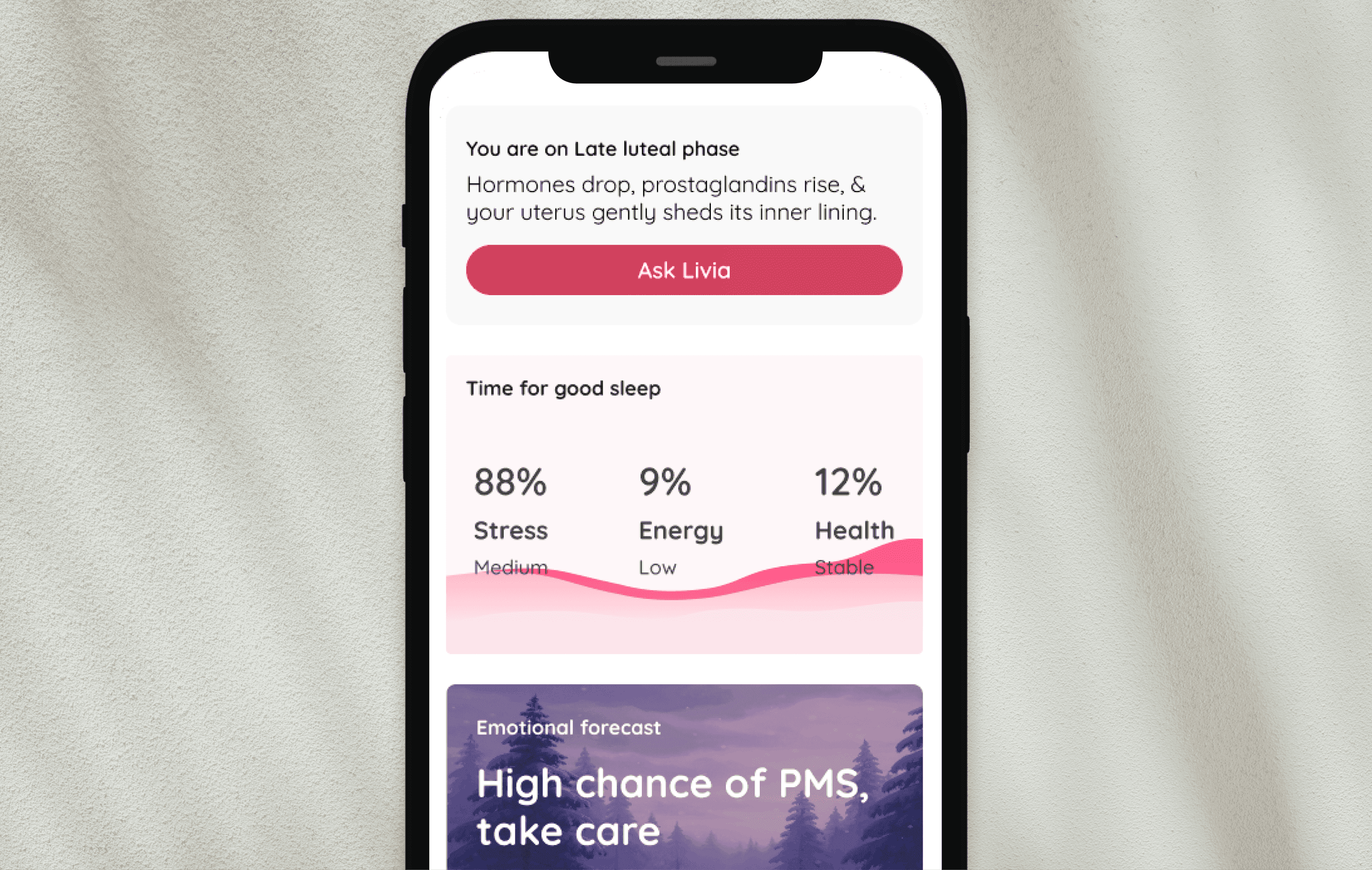
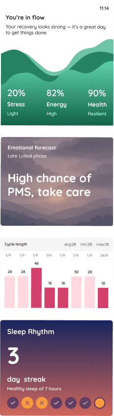
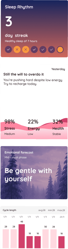
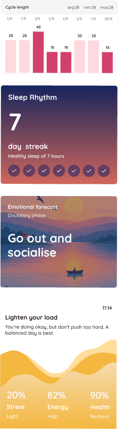
The home surface stopped being a calendar and became a forecast. Emotional weather. Stress score. Cycle countdown. Each card answered the same quiet question a user opened the app to ask: what is happening with me today.
Two hundred small bets, not one big swing.
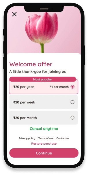
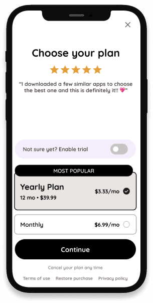
Headline, price point, ladder, CTA, illustration, even punctuation. We tested over two hundred variations. The winners were rarely the prettiest. They were the ones that named the value out loud, at the moment a woman was already feeling it.

A space for shared experience.
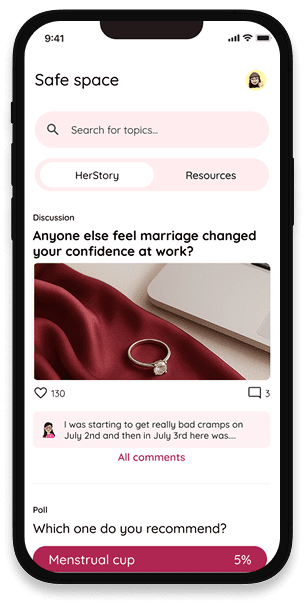
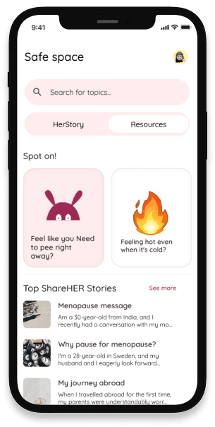
Retention does not come from features. It comes from people. Community spaces normalised what a woman was going through and gave her a reason to return even when her own cycle was quiet.
So what
None of these numbers came from a new feature. They came from the discipline of fixing the fundamentals: trust, daily value, and a paywall that matched the moment.
“Better-looking designs didn't always perform better.”
In several tests, designs that felt less clean or less ideal won against the polished alternative. That kept me honest. The user doesn't care about your taste. They care whether the screen does the thing they came for.