Niyora · My own app
Swipe: keep what fits
Moon offers other ways to see a hard moment. Testers showed me that she has to be the one who decides which ones fit.
DraftPublished Updated 1 min read
This is a working draft. I’m still filling it in.
On this page
Swipe almost didn’t happen
In June I prototyped a calm swipe deck in plain HTML and built it into the PMS version. On my phone, swiping felt like too much work in a bad moment, so a simple grid of activities won.
One in five was enough to lose trust
Testers taught me the sharpest lesson. If Moon shows five ways to see a moment and one feels a little off, people don’t shrug and read the other four. They stop trusting all of it, and they stop opening the app.
That middle ground was the hardest thing to find in the whole build. Moon had to say something worth reading without reaching too far. What finally fixed it was handing her the options and letting her pick.
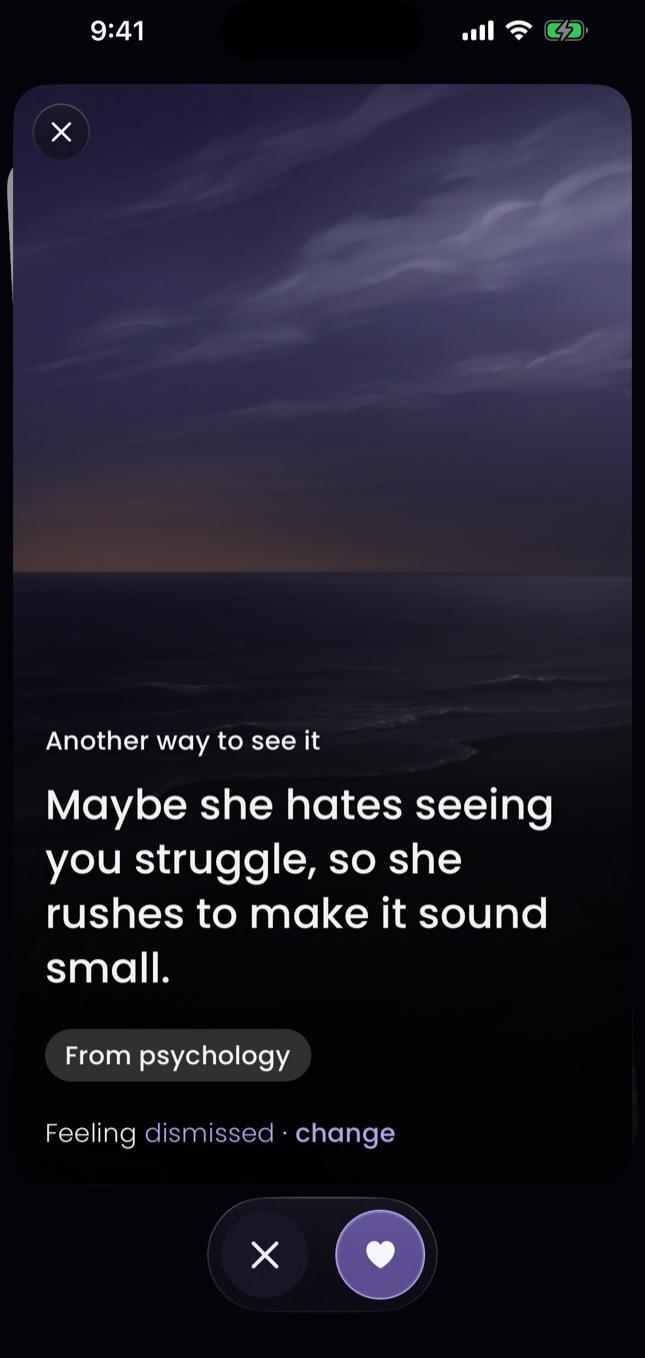
So now she chooses: keep what fits, swipe away the rest, and change the feeling Moon picked.
“Love the design, the moon is beautiful.”
That same early user thought the moon was a “pretty white circle,” and a scale looked like a slider she had to drag. I fixed both that evening. The moon got a caption, and the scale got split into three parts.
How the deck changed
In October Swipe came back, this time for perspectives. One big card at a time. A heart keeps it, a cross lets it go.
There’s no progress bar and no finish line. She stops whenever she likes and picks up where she left off. Swipe is there to help her feel better. Keeping her swiping was never the goal.
What I learned
- When in doubt, let users decide. One wrong suggestion in five is enough to lose trust, and choice wins it back.
- Letting her pick fixed trust faster than any prompt I wrote.
Topics: AI, product design, trust. Also as plain markdown.