From stalled to 4× revenue
Rebuilding trust, engagement, and conversion in a women’s health app
Role
Product Designer
Timeframe
2025-26
Team
Engineer, Designer
Platform
iOS, Android
Discovery
We inherited a women’s health app with ~100k users, but engagement and retention were declining.
What we learned
Mixpanel showed early drop-off before users reached core value.
Onboarding created high cognitive load and failed to establish trust.
Onboarding, engagement, and conversion were the primary growth levers.
Problem
The product experience no longer matched user expectations in a more competitive market.
From a business perspective
Revenue growth had stalled.
Conversion and retention directly impacted revenue.
A 4× revenue goal was at risk without fixing fundamentals.
From a user perspective
Trust was not established early.
Value was unclear before commitment.
Monetization felt misaligned with perceived benefit.

Revenue decline highlighted weaknesses in onboarding, engagement, and conversion.
Impact
The lack of trust and clarity affected both users and the business.
Users dropped off before forming habits.
Engagement was inconsistent.
Paywall conversion was weak.
Retention and lifetime value were under pressure.
Initiative
Instead of a full redesign, we adopted continuous experimentation.
Each critical flow was treated as a testable system, not a one-time design decision.
Behavioral data replaced opinion in prioritization.
A/B testing became the default across onboarding, engagement, monetization, and acquisition.

Continuous experimentation replaced one-time design decisions across the funnel.
Key Decisions
We made deliberate trade-offs to reduce risk and increase learning velocity.
Prioritized trust before collecting personal data during onboarding.
Optimized for daily habits rather than adding new features.
Treated visual design as a hypothesis, not a deliverable.
Rejected visually polished designs that failed to convert.
Favored small, reversible changes over large redesigns.

Small moves. Reversible bets. Long game thinking.
Research
Research combined behavioral data and qualitative signals.
Funnel and drop-off analysis via Mixpanel.
Flow-level A/B testing across critical paths.
App Store experiments on screenshots, messaging, and visual positioning.
Ongoing observation of engagement patterns and churn behavior.
Insights were continuously fed back into design and prioritization.
Design
Design focused on clarity, trust, and habit formation.
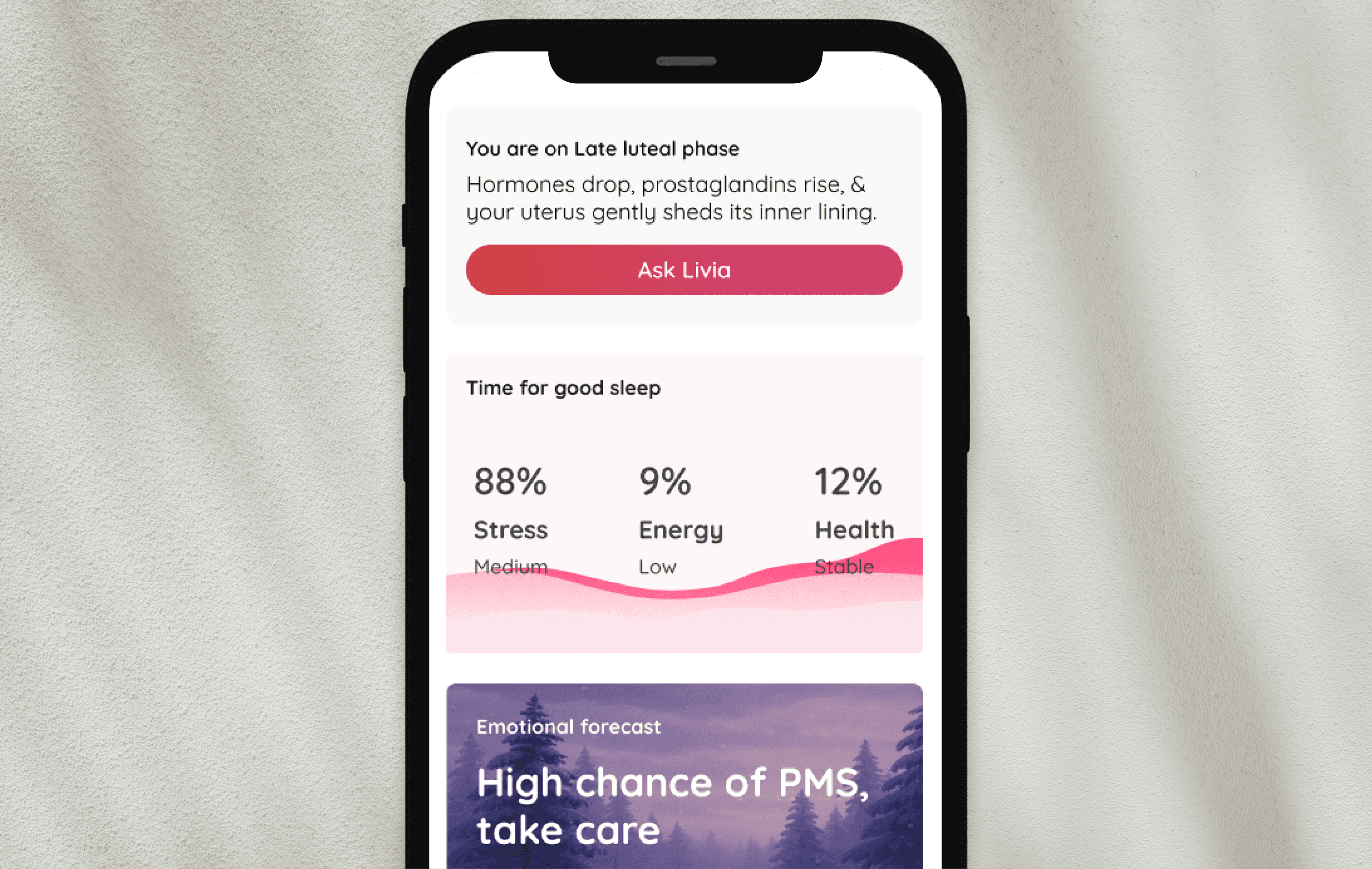
Onboarding was simplified, slowed down, and deliberately sequenced to reduce anxiety.
Language shifted from clinical to supportive to build emotional safety.
Daily experiences emphasized small wins and reassurance to reinforce habits.
Paywalls, core flows, logos, and App Store screenshots were iterated through testing.
Community spaces were designed to normalize experiences and support reflection.

Top line: old & bottom line: New onboarding design

Daily experiences reinforced habits through reassurance and small, repeatable wins.
Paywalls for conversion
Paywalls flow were tested for different offers, onboarding paywall converted the most.

More than 200+ Paywalls were treated as testable hypotheses across copy, layout, and pricing.
Community for retention
Community spaces normalized shared experiences and supported long-term retention.

Community spaces normalized experiences and supported long-term retention.
Outcome
Engagement
Daily engagement increased and retention stabilized. (+18% retention)Monetization
Conversion and revenue per user improved without increasing churn. (+79% conversion)
Retention
Users engaging with community features churned less.
(Metrics tracked through Mixpanel and Conversion)
Reflection
Some features that seem minor can matter a lot to users. When we changed visual elements like wallpapers, we received strong negative feedback, even though the change felt small to us.
Negative reviews didn’t always mean the product was failing. During periods of heavy change, reviews dropped, but revenue continued to grow.
Onboarding turned out to be more than a quick setup. Taking a bit more time helped build trust and led users to the “aha” moment with less effort.
Better-looking designs didn’t always perform better. In several tests, designs that felt less “clean” or less ideal worked better than polished alternatives.
Letting users try key features for free helped them understand the value faster. Giving one day of access to the daily feed led to higher conversion than locking it upfront.
The team worked remotely, across languages, with few meetings. Clear ownership and trust in each other’s strengths helped us move quickly and iterate fast.